Lumipay: A safe, fast and neat way to organise money related trivial for young people.
00. Overview
Introduction
Lumipay is an app makes payment easy and handy for young poeple. The multifunctional app help users with transferring money, tracking spendings and collecting cards.
Role
My responsibilities includeed User research, Ideating concepts, Wireframing, Prototyping, Testing, Iterating on feedback delivering final designs.
Design process
- Research: User interview and survey
- Define: Problem Statement
- Design: Sketching & Design, Prototyping
- Testing: Moderated usability testing
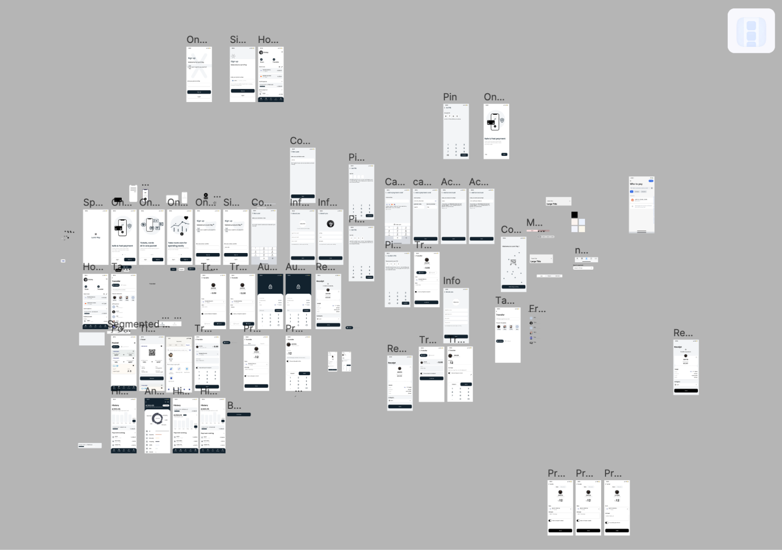
Design preview
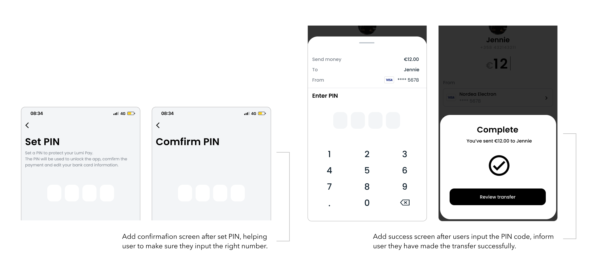
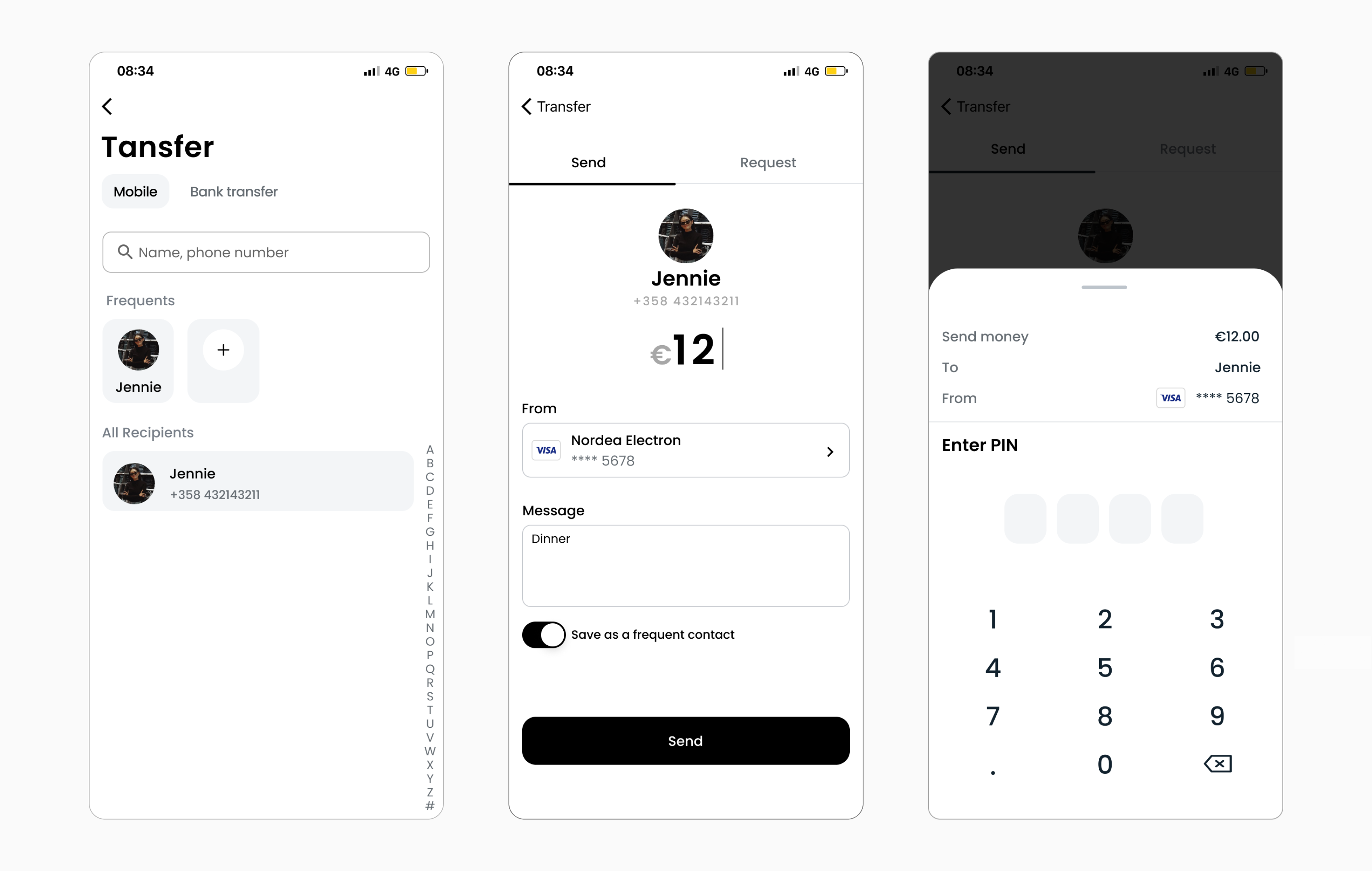
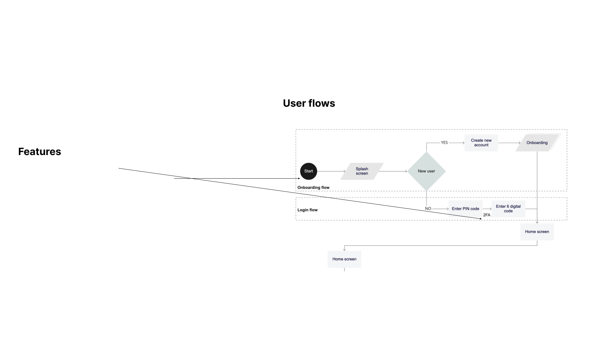
Feature 1: Fast and safe transfer, only in 3 steps
- - Search bar, frequents recipients list and Alphabet list help users quickly find the person they want.
- - Enter PIN before making transfer help user better protect their account.
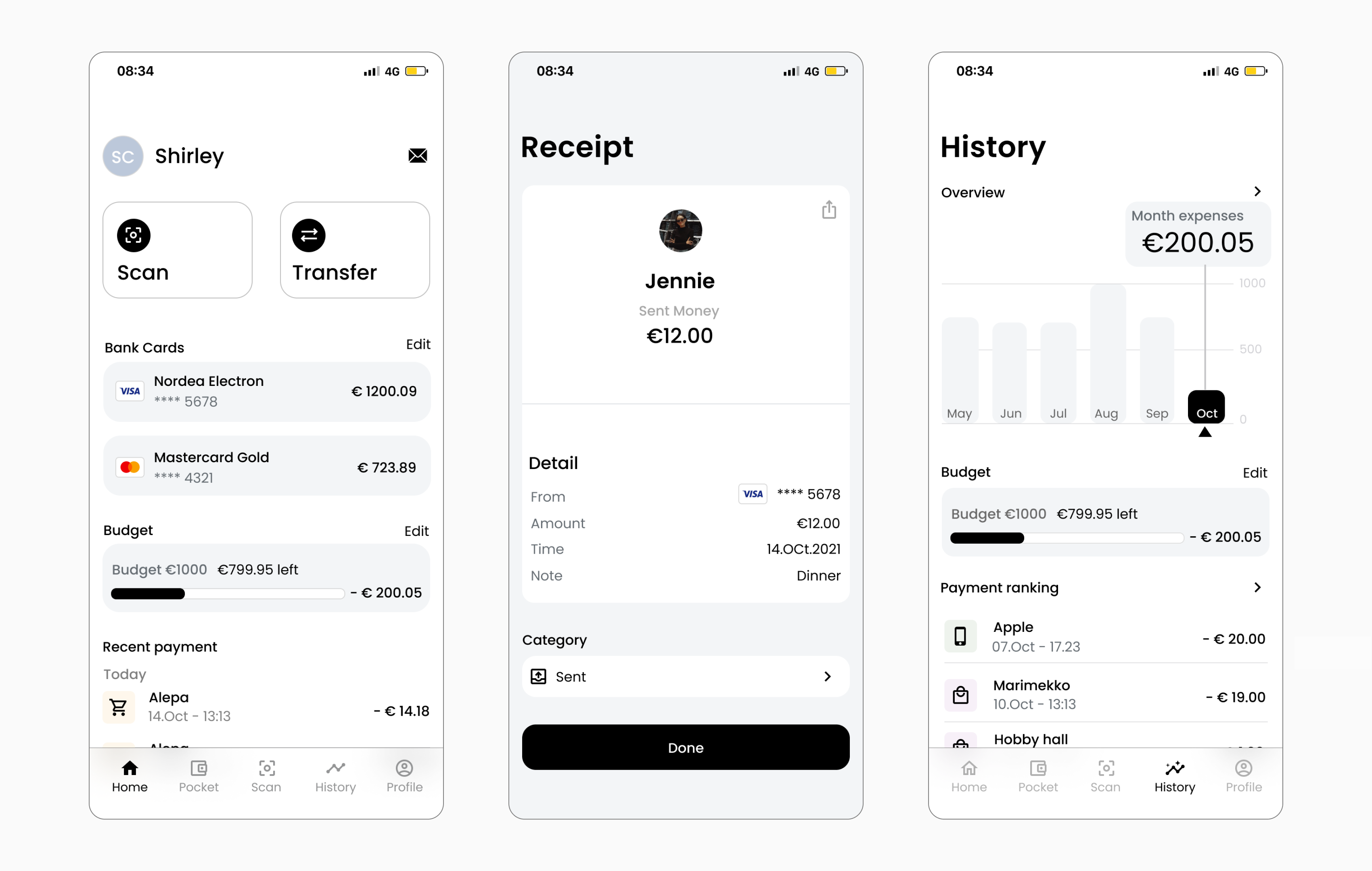
Feature 2: Easy track and analyse spending
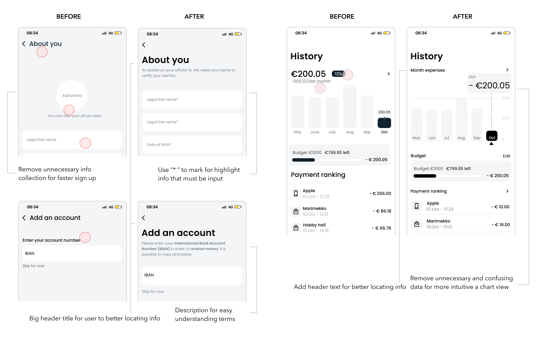
- - Put month expenses and recent payments on the home screen so that user can easily track their budgeting at a glance
- - Place history on the bottom navigation for better accessibility
- - Set category right after the receipt so that user can track spending effortlessl
- - Financial analysis based on time and category format giving better insights according to users needs
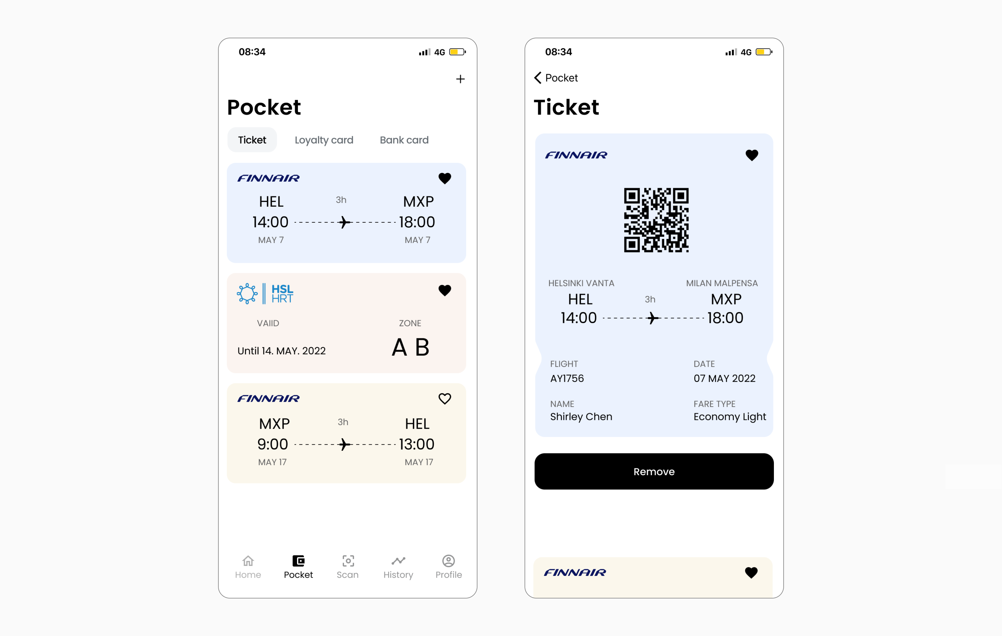
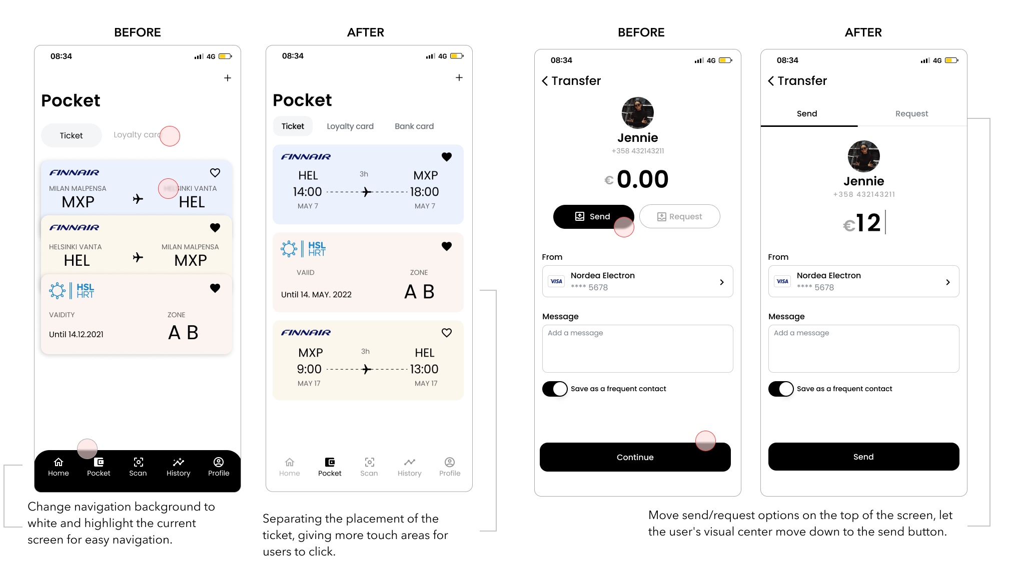
Feature 3: Collect all the things in one pocket
- - Tickets, cards under pocket according to the site map
- - Use tab to organise and navigate between ticket and card which are at the same level of hierarchy
- - Collect function enable user mark their frequent use ticket
- - Overlap the ticket for more space in case user has too many things need to be collected
Feature 4: Step by step onboarding experience with detailed instruction
- - Breaking up this complex payment app register process into a series of steps can make each step less overwhelming and reduce the pressure.
- - Each step clearly indicates why we are collecting certain information
01. Research
How does it start? A payment app contains everything?
As a college student, I've noticed that many of my peers complain about trivial things regarding money. The one I hear the most was “why can't we have an app that contains everything so that I don't have to use separate tools to do money related things” This problem got me thinking, so I decided to explore what is "everything" and how we tackle it.
How do young people use payment app?
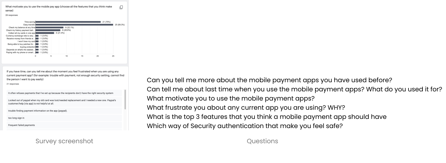
I conducted a User interview + User survey, in order to
- 01. To better understand user behaviour around the activity of transferring and paying
- 02. To determine which features that users prefer to have when using a mobile payment app
- 03. Documenting user pain points with existing mobile payment app on the market
32 (4+28) Participants are involved 4 user interviews were conducted among young people (from age 21-30) 28 responses were received in the user survey in total
In order to identify user insights and I used Affinity Mapping for grouping and understanding information.
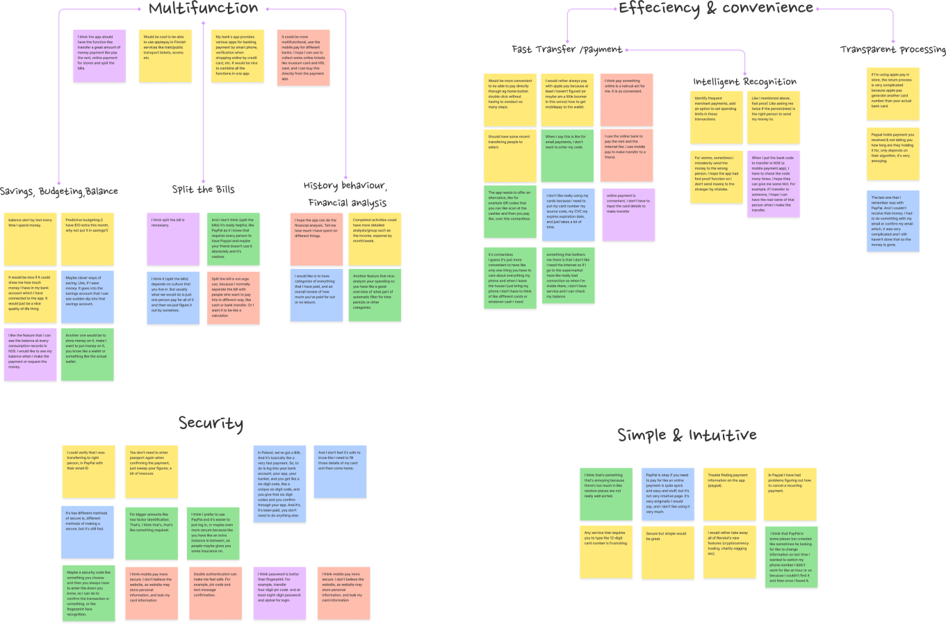
Insights. Everything and more
I've found that students are looking for more than just a multi-functional payment app. They are also very concerned about other aspects.
People want payment apps to be multi-functional. In addition to money transfer functions, other features such as collecting tickets, recording and categorising the spendings also important for them.
Users place a high priority on security. They believe that a combination of different methods of security verification will better protect their accounts.
People are frustrated when they found the onboarding process is not instructive enough and collect information without a reason.
The prefer clean and neat interfaces with necessary functions over crowded new features.
02. Define
Core user goals
Based on the pain points I get from the interviews and survey, I identified the core user goals. Pain points → User goal
Overwhelming with crowded unnecessary features
→ I need a well organized screen with only necessary functions.
Not instructive and informative onboarding
→ I can easily understand what the app can do and why it collects certain information
Worry about the security issues
→ I can trust the app and I feel safe everytime I use
Scope and features
Multifunctional & Neat
-
A way to handle all necessary money related things.
A simple, intuitive and well-organized interface
→
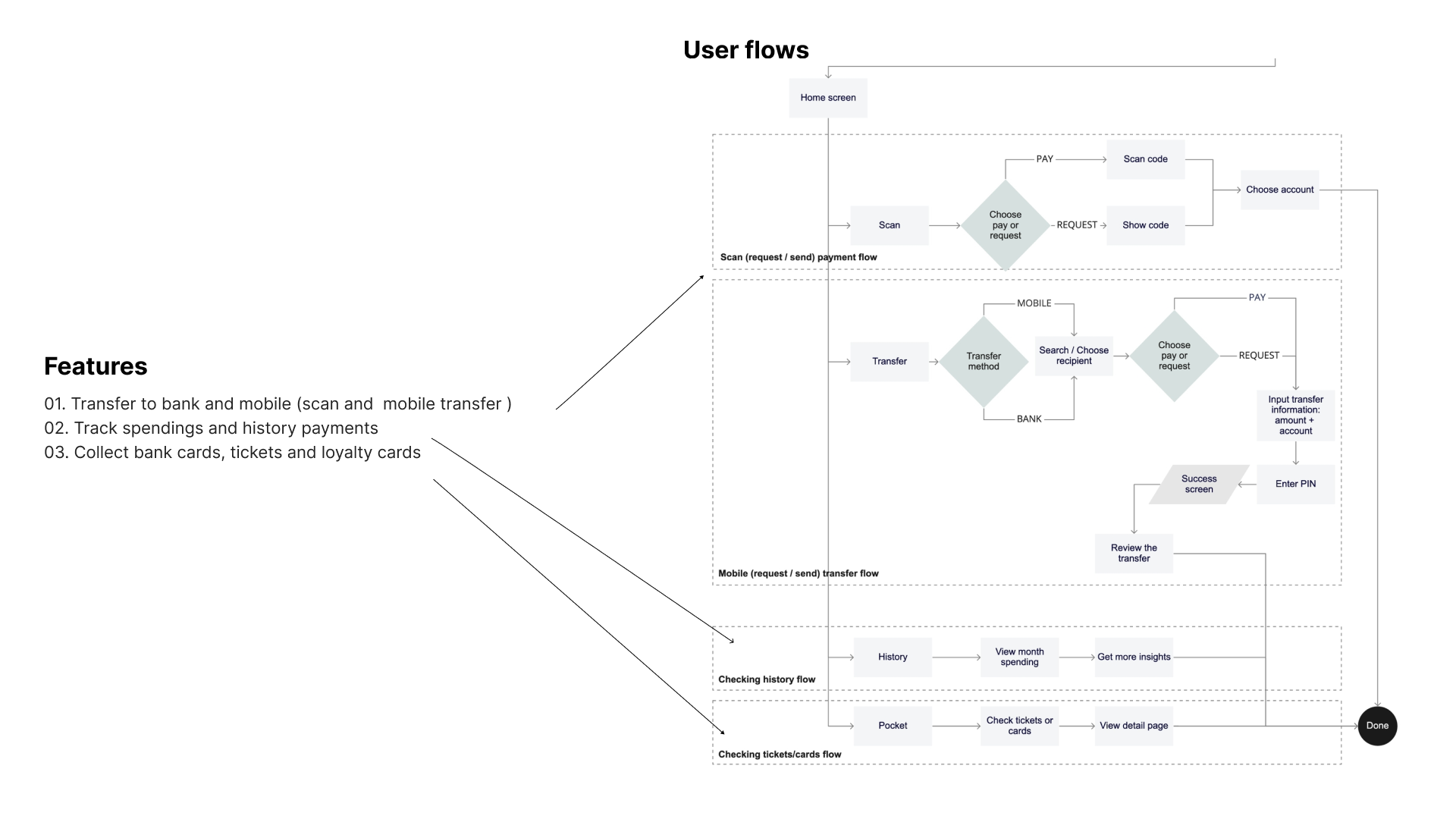
- 01. Transfer to bank and mobile (scan and mobile transfer)
- 02. Track spendings and history payments
- 03. Collect bank cards, tickets and loyalty cards
Smooth & Safe
-
A safe way to deal with money things
easy to get started the first time using the app
→
- 04. Two factor authentication
- 05. Informative and clear onboarding screens
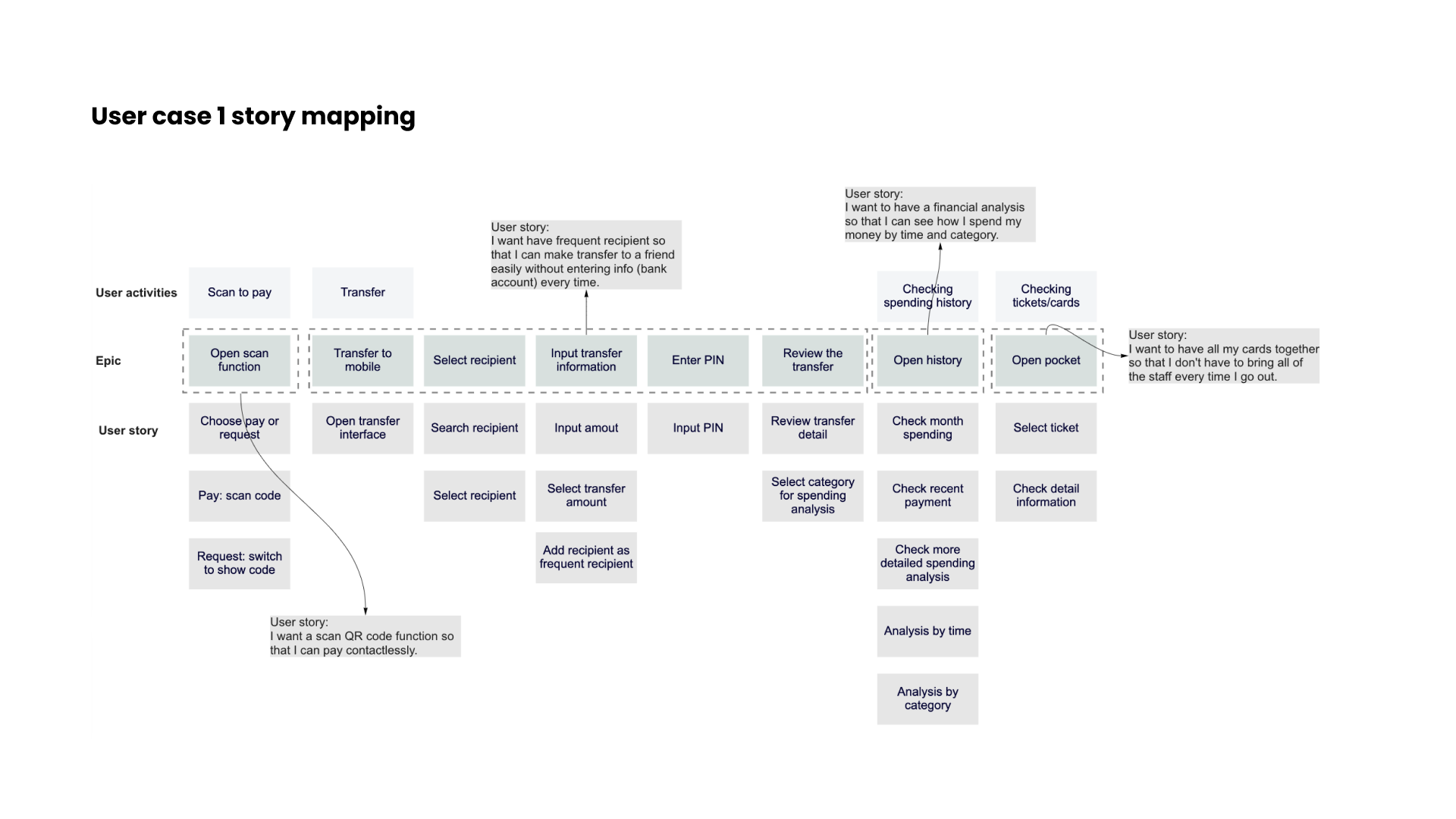
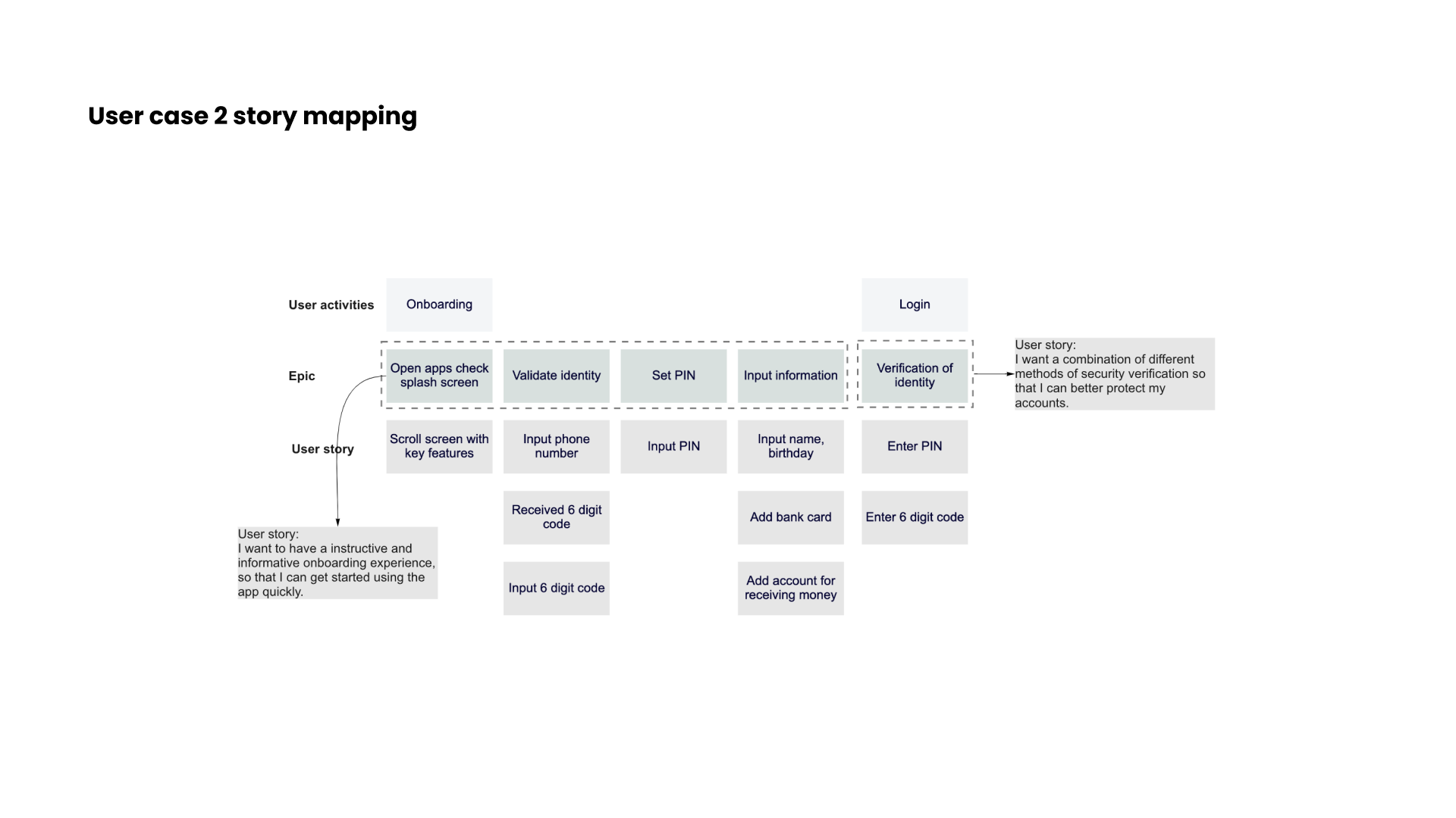
User case
In order to get the solutions in the context of end users and the benefit they’ll receive. I created two user cases.
Case 1
As a person who is afraid of trivial things, I want a payment app with a variety of functions so that I can do money-related things in one place.
Case 2
As a safety concern user, I want to have a informative onboarding experience and a safety authentication so that I can use the app without worrying.
03. Design
Sketches and iterations
In order quickly document my ideas and draft my concept. I used paper and pen to make sketches to move forward.
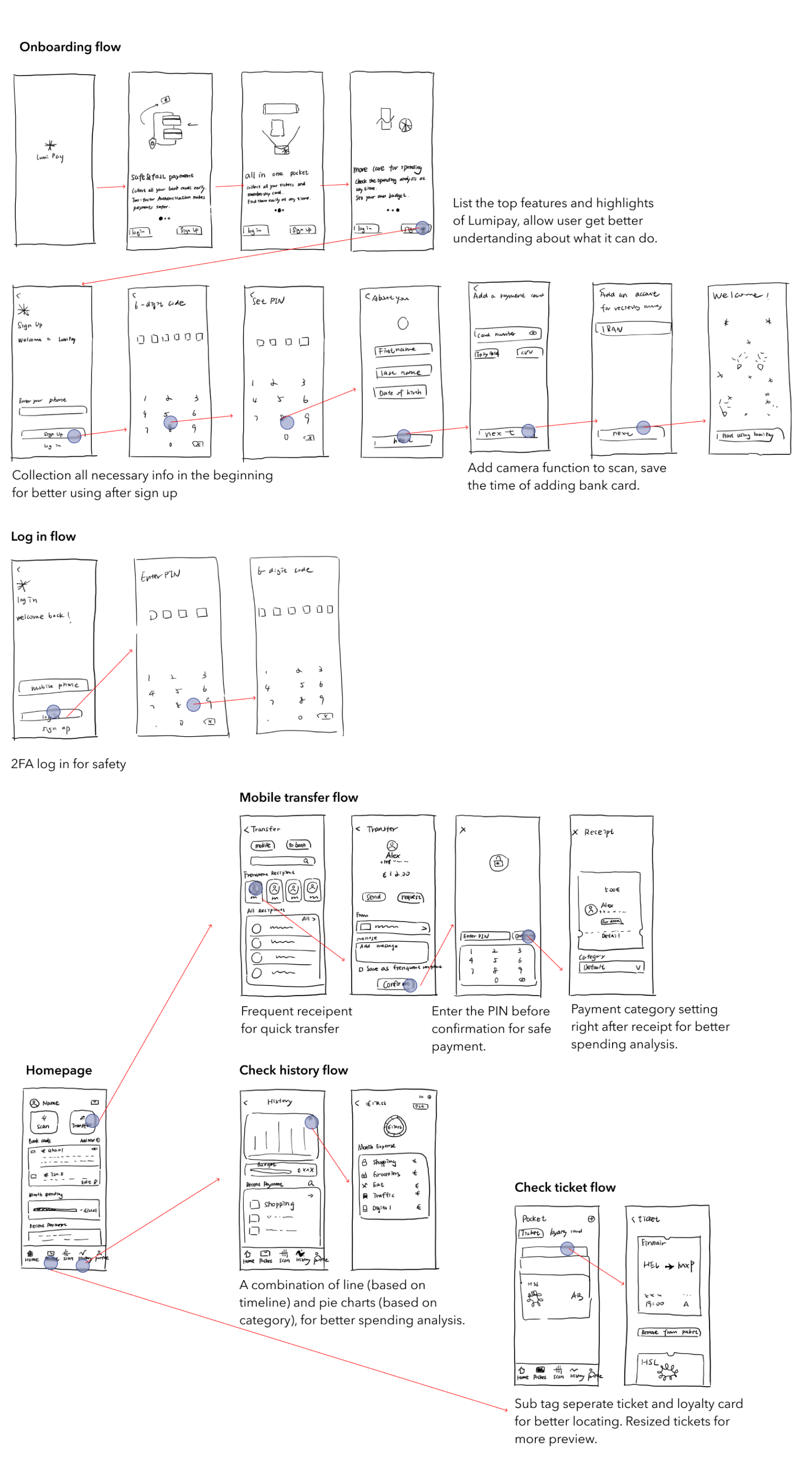
High Fidelity prototype
After 5-6 times iterations of sketch, I turned them into aclickable prototype in order to conduct usability testing.
04. Testing
Prototype, test, and repeat
Moderated in-person testings were taken. The tests included a short briefing, task performance with Lumi Pay conducted on a mobile app, and a debriefing.
Goals:
- 01. Determine how easy and understandable is for participants log in/sign up on the app
- 02. Measure if the participants can easily navigate the app to find the main functions
- 03. Determine if the participants the learnability of the main functions
- - How easy participants can complete the transfer process?
- - Does the spending analysis page intuitive enough for users?
- - Can participants easily check the tickets and loyalty cards?
I recruited 6 participants. They are young people age between 21-30 with the experience of using payment app and they all have the need to use secure, simple anduseful payment applications.
Testing result: Lumi Pay received love from young participants, however...
In order to organise my observation and sorted them into categories, I used the rainbow sheet, which also helps me make decisions in the following steps. I rated the errors by referring Jakob Nielsen's four-steps rating scale.
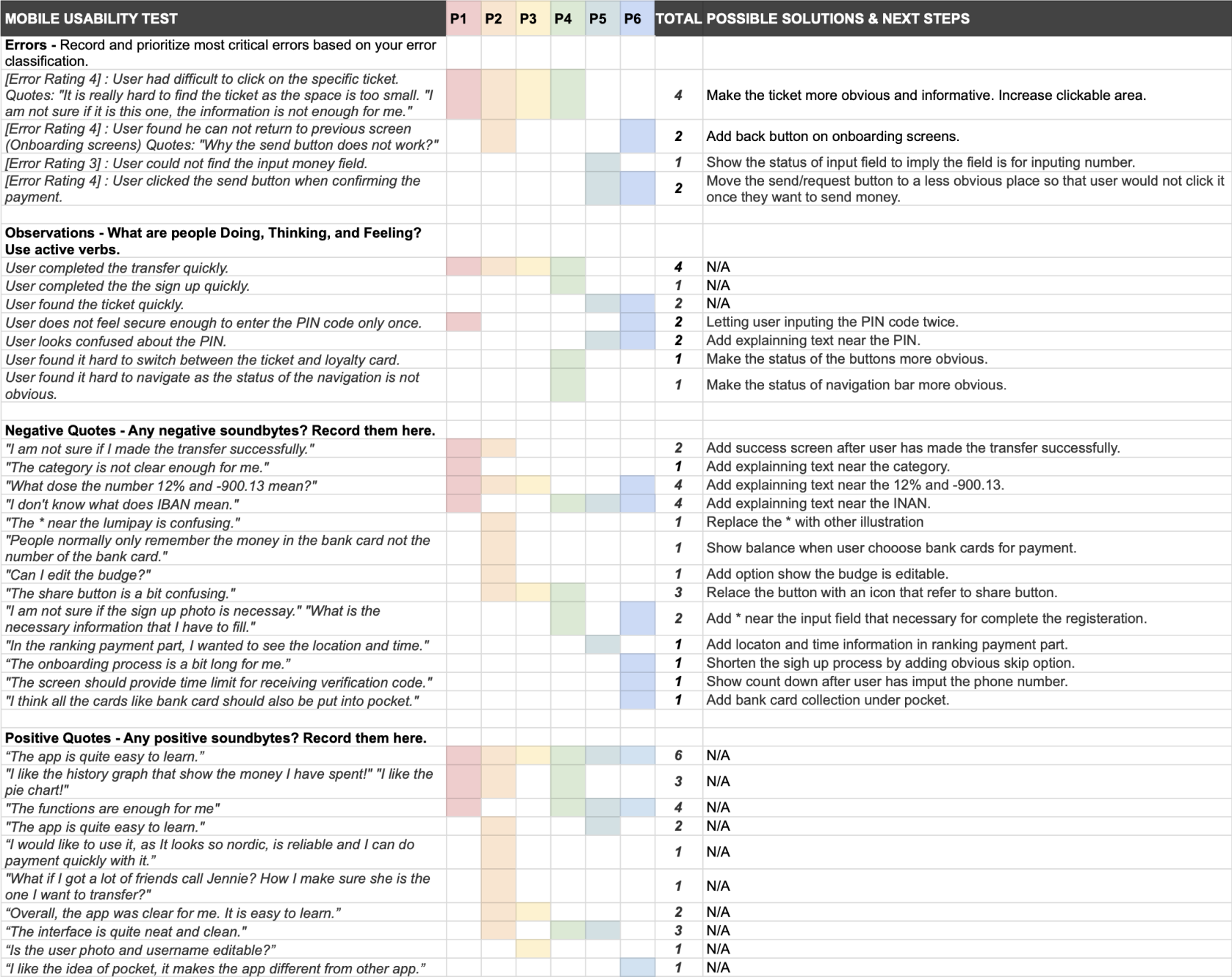
3 Main Improvements
01. More description, less unnecessary info
67% of participants did not know what is IBAN, PIN and the number on the history screens.
33% of participants were confused with the input field when they try to fill
02. Clearer action and easier interaction
67% of participants had difficulty clicking and finding the specific ticket under the pocket function
33% of participants misclicked "send" button when they tried to continue the payment process
03. Better acknowledgement
33% of participants felt unsure after inputting the PIN code only once
33% of participants were not sure if they made the transfer successfully